Waitlist website design concept
Services:
Link:

MSF Mesh Network Waitlist Portal - A UX/UI Design Perspective
1. Introduction & Project Objectives
This case study examines the User Experience (UX) and User Interface (UI) design of the MSF Mesh Network Waitlist Portal. The portal is a conceptual digital platform designed as the primary touchpoint for individuals interested in MSF, a our made-up example company.
The core objectives, from a UX/UI standpoint, were to:
Maximize Lead Generation: Design an intuitive and compelling experience that encourages users to join the waitlist.
Clearly Communicate Value: Effectively convey the core benefits of the MSF mesh network (enhanced speed, security, ease of use) through visual and textual content.
Establish Brand Identity: Create a distinct, futuristic, and trustworthy brand impression for MSF.
Validate Market Interest: Provide a frictionless platform to gauge early adopter interest before a potential product launchю
2. User Experience (UX) & User Interface (UI) Design Strategy
The design strategy centered on creating a highly focused, immersive, and intuitive experience.
Target Audience & User Journey:
User Profile: The design targets tech-savvy individuals, early adopters, and those interested in cutting-edge networking solutions. These users typically appreciate innovative design and clear, concise information.
Desired User Flow: The intended journey is linear and streamlined:
Arrival & Immersion: User lands on the page and is immediately engaged by the dynamic 3D visual.
Value Comprehension: User quickly understands the MSF proposition through the headline and brief descriptive text.
Social Confirmation: User observes the social proof (joiner count), reinforcing credibility.
Effortless Action: User seamlessly enters their email and joins the waitlist.
Positive Feedback: User receives clear confirmation of their successful signup.
Information Architecture (IA) & Content Strategy:
Single-Page Narrative: A single-page architecture was chosen to maintain user focus, minimize navigation complexity, and deliver a cohesive narrative.
Visual & Textual Hierarchy: Information is prioritized to guide the user:
Primary: MSF branding, headline, and main value proposition.
Secondary: The 3D visual element as an engagement tool, the email capture form (CTA).
Tertiary: Social proof, conceptual partner logos, and disclaimer.
Concise Messaging: All textual content is crafted to be direct and impactful, reducing cognitive load and ensuring rapid comprehension.
Visual Design & Branding:
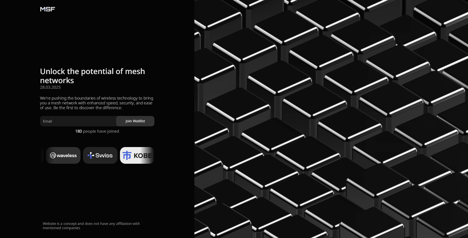
Aesthetic & Mood: A minimalist, dark-themed aesthetic was adopted to convey sophistication, innovation, and a futuristic feel, aligning with the advanced nature of the proposed technology.
Color Palette: The predominant use of dark tones (deep greys/blacks) allows the highlighted edges of the 3D cubes and key interface elements (like the CTA button and selected partner logos) to stand out, creating visual interest and guiding attention.
Typography: Clean, modern sans-serif typefaces are employed for headlines and body text, ensuring excellent readability and reinforcing the contemporary, technological identity of MSF.
Dynamic 3D Background Element:
Implementation: An embedded Spline 3D scene forms the visual centerpiece.
Brand Reinforcement & Engagement: The abstract, animated cubes subtly evoke concepts of network nodes, data blocks, or interconnected systems, visually reinforcing the "mesh network" theme. The continuous, organic up-and-down movement, driven by a noise pattern, creates a captivating, non-repetitive visual experience.
Interactive Immersion: A subtle camera shift that follows mouse movements adds a layer of interactivity and depth, making the environment feel more responsive and engaging, without being distracting. This enhances the user's sense of presence and exploration.
Interaction Design (IxD) & Engagement:
Primary Call-to-Action (Waitlist Form):
Feedback Mechanisms: The design would incorporate immediate client-side validation for the email format. Upon submission, clear visual feedback (e.g., a success message, subtle animation on the button) would confirm the action, ensuring a positive user experience.
Social Proof Element: The "XXX people have joined" counter is strategically placed to leverage the psychological principle of social proof, encouraging new sign-ups by demonstrating existing interest and credibility. Its dynamic nature suggests ongoing activity.
Microinteractions: Subtle hover states on the CTA button, partner logos, or other potential interactive elements would be designed to provide responsive feedback and enhance the tactile feel of the interface.
Accessibility Considerations:
While the visual concept is primary, considerations for accessibility would be important in a live implementation. This includes ensuring sufficient color contrast (especially for text on dark backgrounds and interactive elements), keyboard navigability for the form, appropriate ARIA attributes for screen readers, and ensuring any animations do not negatively impact users with motion sensitivity (e.g., by providing options to reduce motion if this were a more complex site).
3. Key Design Decisions & Rationale
Singular Focus & Conversion Optimization: The entire UI is streamlined to guide the user towards one primary goal: joining the waitlist. Distractions are minimized, and the visual hierarchy consistently points towards the CTA.
Immersive Visual Storytelling for Engagement: The sophisticated 3D background is not merely decorative; it serves as a powerful initial engagement hook, immediately establishing a high-tech, innovative brand image and making the proposition feel more tangible and exciting.
Building Trust and Anticipation: The combination of a clear value proposition, social proof, a professional visual design, and a future-oriented date aims to build user trust and generate anticipation for the MSF product. The conceptual partner logos, while disclaimed, further contribute to an image of potential significance.
4. Conceptual Functional Aspects (from a User Perspective)
Waitlist Signup Process: From the user's viewpoint, the signup process is designed to be exceptionally simple: enter an email and click a button. This low barrier to entry is crucial for maximizing conversions.
Feedback Loop: The system should provide immediate and clear feedback confirming a successful signup (e.g., an inline message or a subtle change in the form area), reassuring the user that their action was completed.
5. Conclusion: Anticipated Design Impact
The UX/UI design strategy for the MSF Waitlist Portal aims to create a highly effective lead generation tool. By combining a compelling, immersive visual experience with a clear, frictionless user journey, the design intends to:
Capture significant user interest and build a robust waitlist.
Solidify a forward-thinking and reliable brand image for MSF.
Provide a strong platform for validating market demand for the proposed mesh network technology.
This focused approach on user experience and interface design positions the conceptual portal to effectively meet its pre-launch objectives.