Simple agency landing site design
Project:
Link:

Project Overview & Design Philosophy
The "Aspect" website is a single-page application (SPA) designed to provide a seamless, scroll-driven narrative. The core philosophy revolves around:
Minimalism & Clarity: A clean, uncluttered UI with a strong focus on typography and whitespace. The greyscale palette with selective accent colors (implied by the 3D elements) creates a sophisticated and focused aesthetic.
Impactful Visuals: Strategic use of a prominent 3D composition and high-quality mockups to showcase brand design capabilities.
Direct Conversion Funnel: Clear calls-to-action (CTAs) strategically placed to guide users towards contact.
Technical Breakdown & Section Analysis
Global Elements: Navigation
Component: Sticky Navigation Bar.
Elements:
"Aspect" Logo (Left-aligned)
Hamburger Menu Icon
"Contact Us" CTA Button (Right-aligned, primary CTA)
Implementation Notes (Framer):
Built as a reusable component.
position: sticky or Framer's equivalent for persistent visibility.
The hamburger icon likely triggers an overlay or drawer menu, built with Framer's interactive states and animations.
The "Contact Us" button would use Framer's link functionality to scroll to the contact section.
Section 1: Hero
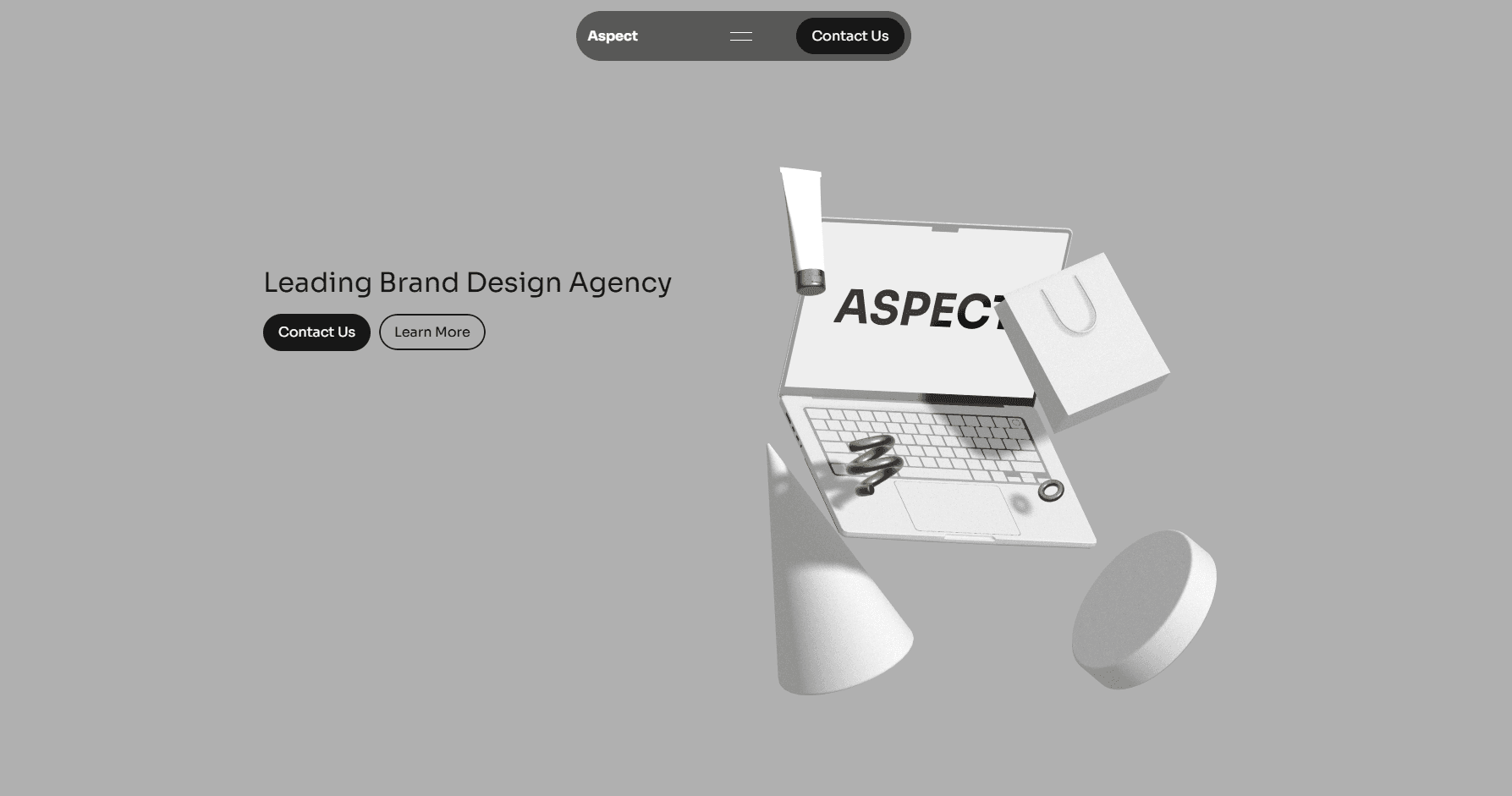
Objective: Immediate brand positioning and primary engagement.
Layout: Split-screen tendency; ~50% text, ~50% 3D visual.
Key Components:
Headline: "Leading Brand Design Agency" - Clear value proposition.
CTAs:
"Contact Us" (Primary, solid fill) - Scrolls to contact form.
"Learn More" (Secondary, outline) - Scrolls to "Who We Are" or "Services."
Spline 3D Composition:
Content: Laptop displaying "ASPECT", shopping bag, abstract geometric shapes. Grainy texture applied for a tactile feel.
Technical Implementation (Spline & Framer):
3D scene created and exported from Spline (likely as a public URL or embedded iframe).
Integrated into Framer either via an embed component or Framer's direct Spline integration.
Potential Interactivity (Spline): Could be configured for mouse-over effects, subtle animations on scroll, or even camera manipulation, though not explicitly shown.
Performance: Spline's web-optimized rendering is crucial here to prevent slow load times. Careful consideration of polygon count and texture sizes.
Section 2: "Who We Are"
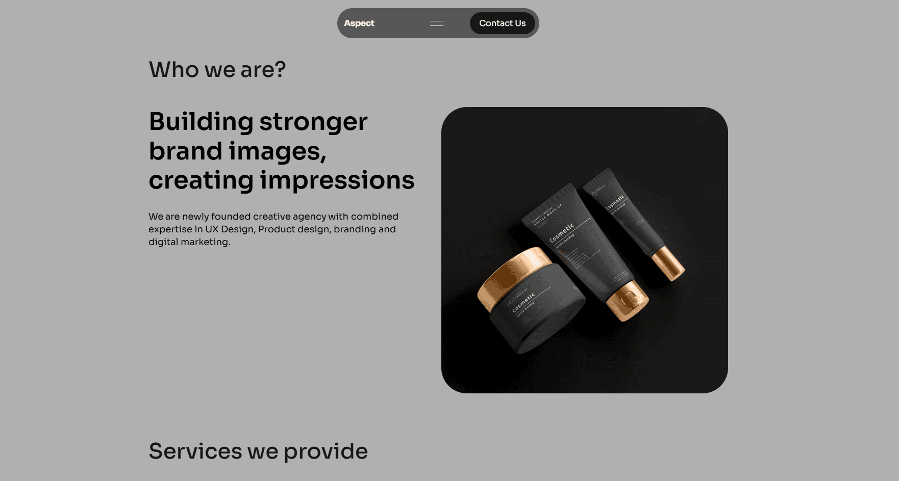
Objective: Introduce the agency and its expertise.
Layout: Asymmetrical two-column layout. Text on the left, image on the right.
Key Components:
Section Title: "Who we are?"
Headline: "Building stronger brand images, creating impressions."
Descriptive Text: Provides context and details about the agency's expertise.
Visual: Rounded-corner container holding a mockup of cosmetic products. This serves as a subtle portfolio piece, showcasing branding application.
Implementation Notes (Framer):
Utilizes Framer's layout tools (stacks, grids) for responsive column management.
Image container with border-radius.
Section 3: "Services We Provide"
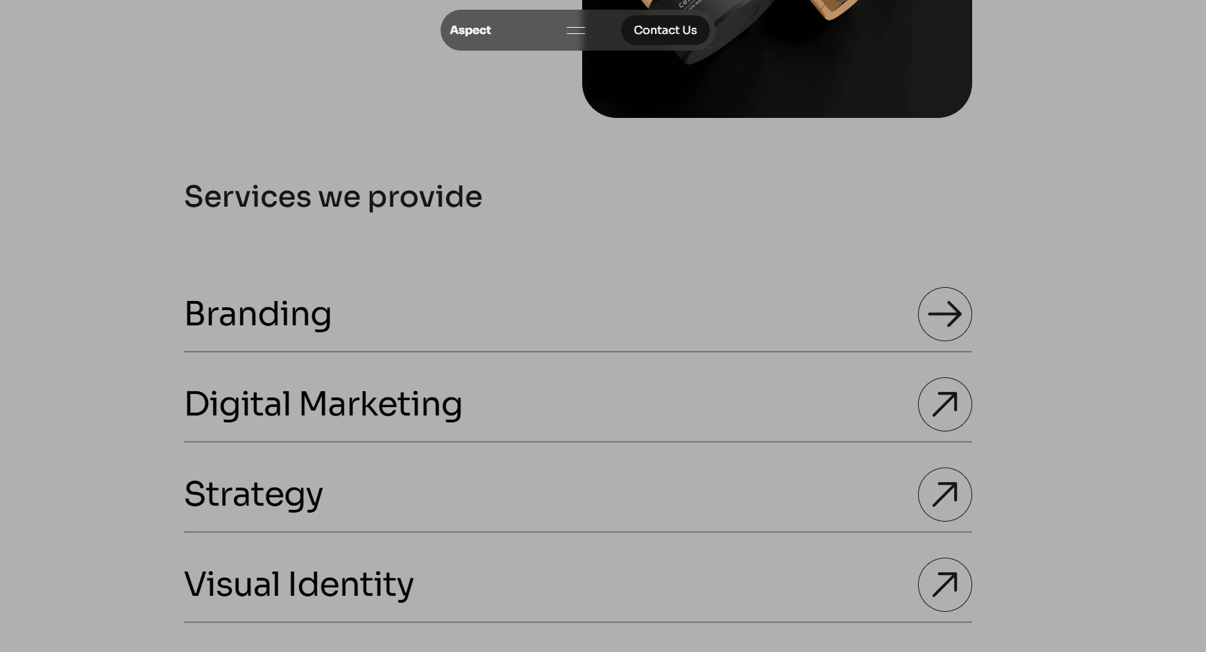
Objective: Clearly list core service offerings.
Layout: Full-width list format.
Key Components:
Section Title: "Services we provide"
Service Items: (Branding, Digital Marketing, Strategy, Visual Identity)
Each item is a text label with a horizontal divider below.
Right-aligned circular icon with an arrow, suggesting a link or expansion
Implementation Notes (Framer):
Likely a vertical stack of custom components, each representing a service item.
The icon could be an SVG or a Framer-supported icon library.
Hover states could be applied to the service items for subtle interactivity.
Section 4: "Trusted By"

Objective: Build credibility through social proof.
Layout: Horizontal display of logos.
Key Components:
Section Title: "Trusted by" (implied, or just above the logos)
Logo Placeholders: Faded generic "Logo" placeholders.
Implementation Notes (Framer):
Likely a horizontal stack or a simple grid.
Could be implemented as a scrolling carousel (e.g., using Framer's overflow: scroll with scroll-snap or a dedicated carousel component) for a larger number of logos.
The faded effect on placeholders is a design choice, actual logos would be crisp.
Section 5: "Contact Us"
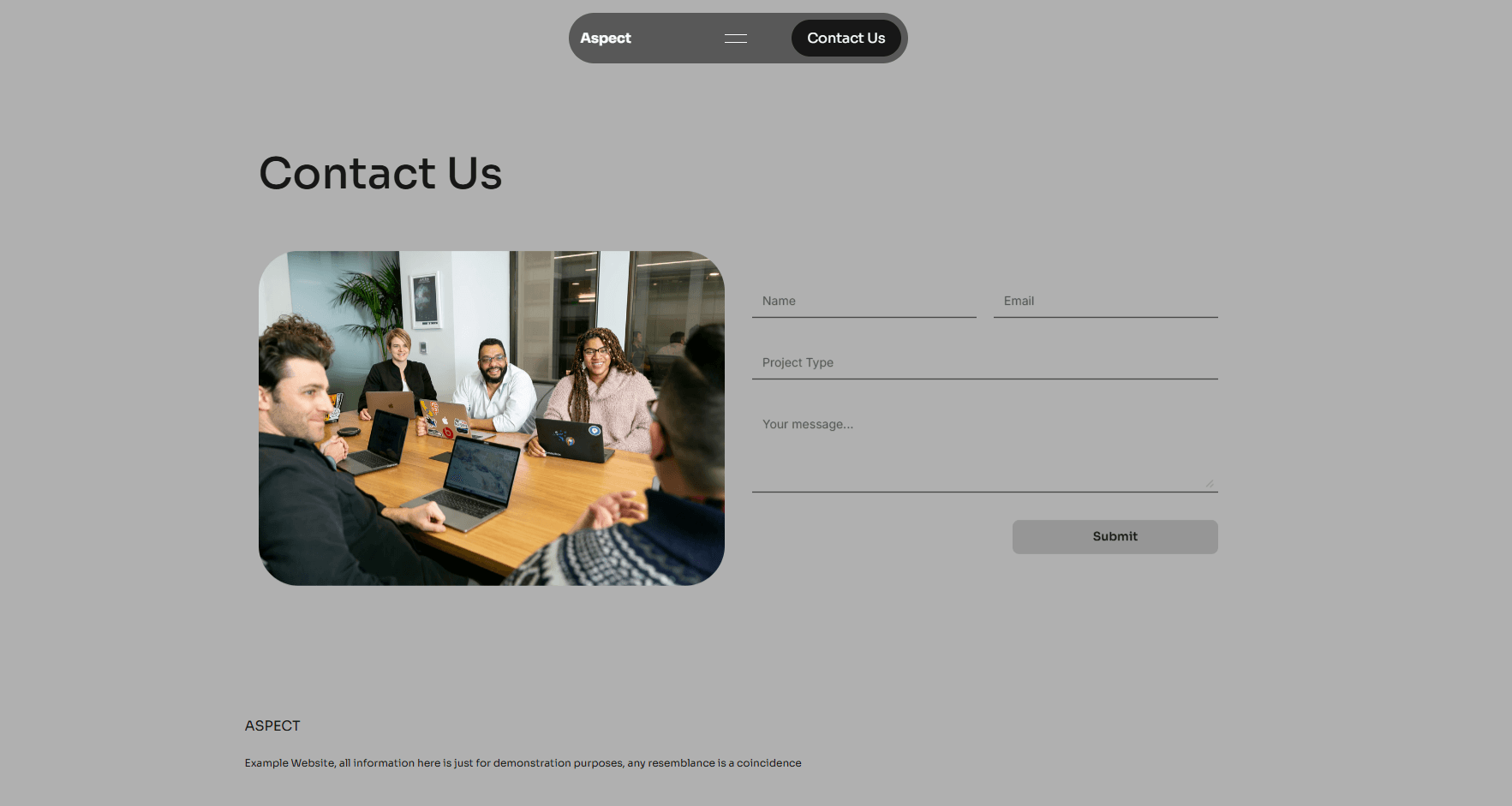
Objective: Primary conversion point - lead generation.
Layout: Two-column layout. Image on the left, form on the right.
Key Components:
Section Title: "Contact Us"
Contextual Image: Rounded-corner image of a team meeting, adding a human element.
Form Fields:
Name (Input)
Email (Input, type="email")
Project Type (Input/Select)
Your message... (Textarea)
Submit Button: "Submit" (Solid fill, likely disabled state until form is valid, or by design)
Implementation Notes (Framer):
Framer's built-in form input components.
Form submission could be handled via Framer's integrations (e.g., Formspark, Airtable, or a custom backend API call).
Basic client-side validation (e.g., required fields, email format) can be configured in Framer.
The greyed-out submit button suggests a disabled state or simply a stylistic choice for the mock.
Key Technical Decisions & Advantages
Framer as a Core Platform:
Rapid Prototyping & Iteration: Framer allows for quick visual building and testing of layouts and interactions.
Component Reusability: Sections like the navigation bar, service items, or CTA buttons can be built as components for consistency and efficiency.
Built-in Responsiveness: Framer's layout tools (stacks, grids, constraints) simplify the creation of a responsive design that adapts to various screen sizes.
Interaction Design: Framer excels at adding micro-interactions, animations, and state changes without complex coding.
Spline 3D Integration:
High Visual Impact: Provides a modern, engaging element that stands out.
Web-Native: Spline outputs are designed for the web, offering relatively good performance if scenes are optimized.
Ease of Integration: Embedding Spline scenes into Framer is straightforward.
Single-Page Architecture:
Fluid User Experience: Content loads once, and navigation is via smooth scrolling.
Focused Narrative: Guides the user through a predefined story from introduction to conversion.